Interior paint color trends
Table of Contents
Paint color Psychology in Interior Design
Color psychology plays a crucial role in interior design, as it can significantly influence the mood and ambiance of a space. Certain colors are known to evoke specific emotions and feelings, making it essential to select hues carefully when designing a room. For example, warm tones like red and yellow are often associated with energy and warmth, making them ideal choices for areas where social interaction is encouraged, such as living rooms or dining spaces. On the other hand, cool tones like blue and green tend to create a sense of calm and serenity, making them suitable for bedrooms or relaxation areas.
In addition to individual color associations, the combination of colors also plays a vital role in interior design. Complementary colors, such as blue and orange, can create a dynamic and visually striking contrast, while analogous colors, like blue and green, offer a more harmonious and cohesive look. Understanding how different colors interact with each other is key to creating a balanced and aesthetically pleasing interior that aligns with the desired atmosphere of the space.
Popular Color Choices for Living Rooms
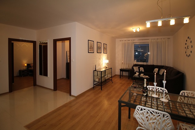
When it comes to popular paint color choices for living rooms, neutral tones have long been a go-to option for many homeowners. Shades of beige, grey, and white create a versatile and timeless backdrop that complements a variety of decor styles. These hues can help make a space feel more spacious and airy, making them ideal for living rooms of all sizes. Additionally, neutral colors provide a calming and harmonious atmosphere, perfect for unwinding after a long day.
In recent years, there has been a shift towards incorporating bolder and more adventurous paint color into living room design. Rich jewel tones like emerald green, sapphire blue, and ruby red can add depth and drama to a space, creating a sophisticated and luxurious feel. These bold hues can be used on accent walls, furniture pieces, or through accessories to inject personality and flair into the living room. Pairing these striking colors with neutral tones can help balance the overall aesthetic and create a visually stunning and inviting space for entertaining guests or relaxing with family.
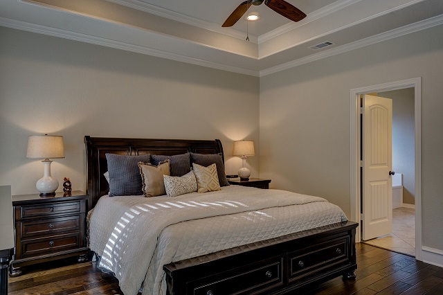
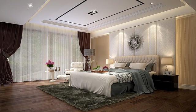
Trending Neutrals for Bedrooms
When it comes to creating a tranquil and soothing atmosphere in the bedroom, neutrals paint colors are an ever-popular choice among homeowners and interior designers alike. Neutral colors such as soft beige, warm taupe, and subtle greys are currently trending for bedrooms, offering a timeless and calming aesthetic. These hues provide a versatile backdrop for various decor styles and can easily be paired with different accent colors to enhance the overall ambiance of the space.
Incorporating trending neutrals into the bedroom can help create a restful retreat conducive to relaxation and sleep. To add depth and dimension to the neutral color scheme, consider introducing varying shades of neutrals through bedding, pillows, and throws. Additionally, texture plays a crucial role in elevating the neutral palette, with elements like plush rugs, cozy knit blankets, and linen curtains adding tactile appeal to the room. When choosing neutrals for the bedroom, aim for hues that complement each other harmoniously to achieve a cohesive and inviting space where you can unwind after a long day.
Bold and Vibrant Hues for Accent Walls
One of the most effective ways to infuse personality and character into a room is by incorporating bold and vibrant hues for accent walls. Bold colors can create a focal point, adding visual interest and depth to a space. When choosing a bold color for an accent wall, consider the overall color palette of the room and opt for a shade that complements the existing decor.
For those looking to make a statement, vibrant hues such as electric blue, fiery red, or emerald green can inject energy and personality into a room. These intense colors can evoke different emotions and set the tone for the space. When using bold and vibrant hues for accent walls, it’s essential to balance them with more neutral tones in the room to prevent overwhelming the space and to create a harmonious look.
Choosing the right paint color for small spaces
When it comes to selecting the perfect paint color for small spaces, it’s essential to consider the impact that different hues can have on the perception of size and light. Light colors such as soft whites, pale blues, and subtle greens can help make a room feel more spacious and airy. These colors reflect natural light, giving the illusion of openness and brightness. On the other hand, dark colors like deep navy, charcoal gray, and rich burgundy can create a sense of coziness and intimacy in small rooms, but may also make the space feel more enclosed if not balanced correctly with light elements.
Additionally, using monochromatic color schemes in small spaces can help create a sense of continuity and flow, making the room appear larger and more cohesive. By choosing different shades of the same color family for walls, furniture, and decor accents, you can visually expand the space without overwhelming it with too much contrast. It’s important to strike a balance between light and dark tones within the monochromatic palette to maintain interest and depth in the design while maximizing the perceived spaciousness of the room.
The Impact of Natural Light on Paint Colors
Natural light plays a pivotal role in how paint colors appear within interior spaces. The intensity and direction of sunlight can drastically alter the perception of hues, making it essential to consider these factors when selecting paint for a room. Rooms that receive ample natural light tend to showcase colors more vibrantly, while those with limited sunlight may benefit from lighter shades to create a sense of brightness and airiness. Understanding how natural light interacts with paint colors is crucial for achieving the desired atmosphere within a space.
In addition to considering the amount of natural light a room receives, it is important to contemplate the time of day when choosing paint colors. The angle and quality of sunlight can vary throughout the day, causing colors to shift in appearance from morning to evening. To accurately assess how a paint color will look in a room, it is advisable to test samples at different times to gauge how natural light influences their appearance. By being mindful of how sunlight impacts paint colors, interior designers and homeowners can create spaces that feel harmonious and visually pleasing.
Incorporating Color Trends in Kitchen Design
When it comes to incorporating color trends in kitchen design, it’s essential to strike a balance between functionality and style. By infusing your kitchen with the latest color palettes, you can transform it into a modern and inviting space. Whether you opt for bold pops of color or subtle accents, choosing the right hues can make a significant impact on the overall aesthetics of your kitchen.
One of the current color trends in kitchen design is the use of earthy tones such as terracotta, sage green, and warm neutrals. These colors add a sense of warmth and sophistication to the space, creating a cozy and inviting atmosphere. Pairing these earthy tones with natural materials like wood and stone can further enhance the organic feel of the kitchen, making it a harmonious and stylish environment for cooking and gathering.
Creating a Cozy Atmosphere with Warm Tones
When it comes to creating a cozy atmosphere in your living space, incorporating warm tones into your interior design can make all the difference. Shades of rich reds, earthy oranges, and soft yellows evoke feelings of warmth and comfort, perfect for areas where you want to unwind and relax after a long day. These warm hues can be introduced through accent walls, furniture pieces, or even textiles like throw blankets and cushions to add a touch of coziness to any room.
Incorporating warm tones into your decor can also help create a sense of intimacy and welcome in your home. By choosing colors like terracotta, cinnamon, or caramel for your walls or furnishings, you can instantly transform a room into a cozy retreat that exudes warmth and hospitality. Pairing these warm tones with natural textures like wood accents or plush rugs can further enhance the inviting ambiance, making your space a haven for relaxation and rejuvenation.
Cool Blues and Greens for a Relaxing Bathroom
When it comes to creating a tranquil and inviting bathroom space, cool blues and greens are a popular choice for many homeowners. These calming hues evoke a sense of serenity and relaxation, making them ideal for unwinding after a long day. Consider painting your bathroom walls a soft blue or green shade to bring a peaceful ambiance to the room. Pairing these colors with white fixtures and accessories can create a clean and refreshing look that is perfect for a spa-like atmosphere.
In addition to painting the walls, incorporating blue and green accents through towels, rugs, and décor can help tie the color scheme together. Opt for shades of aqua, turquoise, or seafoam to add a pop of color without overwhelming the space. Consider adding plants or botanical-themed artwork to bring a touch of nature indoors and enhance the calming vibe of the bathroom. By carefully selecting and combining various shades of cool blues and greens, you can transform your bathroom into a soothing sanctuary where you can relax and rejuvenate.
Paint Finishes: Matte vs. Glossy
When it comes to selecting the right paint finish for your interior space, the choice between matte and glossy finishes plays a significant role in achieving the desired look and feel. Matte finishes, known for their velvety texture and low sheen, are popular for their ability to hide imperfections and create a more understated aesthetic. They are ideal for spaces where a softer, more muted appearance is desired, adding a touch of sophistication and elegance to the walls.
On the other hand, glossy finishes are characterized by their high sheen and reflective quality, which can bring a sense of brightness and depth to a room. While they are more prone to highlighting imperfections on the surface, glossy finishes are easier to clean and maintain, making them a popular choice for areas that require frequent cleaning, such as kitchens and bathrooms. The decision between matte and glossy finishes ultimately depends on the desired look, functionality, and overall design scheme of the space.
Mixing and Matching Colors for a Cohesive Look
When it comes to creating a cohesive look in your interior design, mixing and matching paint color is a key strategy to achieve a harmonious aesthetic. Select a primary color to serve as the foundation for your space and then incorporate complementary hues to add depth and visual interest. Consider using a color wheel to help you identify combinations that work well together, such as analogous colors for a more subtle blend or complementary colors for a bolder contrast.
One effective technique for mixing and matching colors is to vary the saturation and intensity of hues within the same color family. This can create a layered effect that adds dimension to your space. Additionally, incorporating different textures and finishes in your color scheme can enhance the overall visual appeal and lend a sense of sophistication to the design. Remember to balance bold and neutral tones to create a well-rounded palette that exudes both personality and sophistication.
Statement Ceilings: Using Color to Add Interest
When it comes to adding visual interest and character to a room, statement ceilings can play a key role in transforming a space. By incorporating paint color on the ceiling, you can create a unique focal point that draws the eye upwards, making the room feel more spacious and inviting. Whether you choose a bold hue to make a dramatic statement or opt for a softer tone to complement the overall design scheme, the ceiling offers a prime opportunity to showcase your style and creativity.
When selecting a color for a statement ceiling, it’s important to consider the overall look and feel of the room. Darker colors can add a sense of coziness and intimacy, making large rooms feel more intimate, while lighter colors can create an airy and open atmosphere. Additionally, using a high-gloss finish can reflect light and add a touch of glamour to the space, while a matte finish can provide a more subtle and sophisticated look. Experimenting with different color palettes and finishes can help you achieve a statement ceiling that not only adds interest but also enhances the overall aesthetic of the room.
Color Trends for Mid-Century Modern Interiors
Mid-century modern interiors are known for their iconic color palettes that exude a sense of sophistication and timelessness. When it comes to incorporating color trends into these design schemes, muted earth tones like olive green, mustard yellow, and burnt orange are making a comeback. These hues complement the clean lines and organic elements often found in mid-century modern furniture and décor, adding a touch of warmth and charm to the space.
In addition to earthy tones, jewel tones such as sapphire blue, emerald green, and amethyst purple can also be used to infuse a sense of luxury and boldness into mid-century modern interiors. These rich colors create a striking contrast against the neutral backdrop typical of this design style, elevating the overall aesthetic and adding a touch of drama to the space. By incorporating these trending hues thoughtfully and strategically, you can create a visually captivating and stylish mid-century modern interior that pays homage to the design ethos of the era.
Painting Techniques for Textured Walls
Creating a visually appealing space with textured walls requires careful consideration and skillful painting techniques. One effective method is to use a technique called “dry brushing.” This involves using a nearly dry brush to apply paint lightly over the textured surface, accentuating the raised areas while leaving the recessed areas untouched. This technique adds depth and dimension to the walls, giving them a unique and interesting look.
Another popular painting technique for textured walls is stippling. Stippling involves using a stippling brush or sponge to dab paint onto the textured surface in a repeated pattern. This method can create a soft and mottled effect, perfect for adding a subtle touch of color and texture to a room. By mastering these painting techniques for textured walls, you can transform any space into a visually captivating and dynamic environment.
Staying Ahead of the Curve: Forecasting Future paint color Trends.
Being able to anticipate future paint color trends in interior design is crucial for staying ahead in the industry. Designers and homeowners alike are always seeking fresh, innovative color palettes to enhance their spaces. As we look to the future, we can expect to see a shift towards earthy tones, inspired by nature’s calming and grounding effects. Shades of terracotta, olive green, and warm browns are predicted to take center stage, bringing a sense of tranquility and connection to the outdoors into our interiors.
In addition to earthy tones, we can also anticipate a rise in popularity of bold and vibrant colors that make a statement. Rich jewel tones such as deep emerald, sapphire blue, and burnt orange are forecasted to add a touch of luxury and drama to spaces. These bold hues can be incorporated through accent walls, statement furniture pieces, or vibrant accessories to inject personality and energy into a room. By staying informed and being open to exploring new color combinations, interior designers can effortlessly adapt to evolving trends and create visually striking spaces that resonate with clients.