Choosing the right interior paint colors
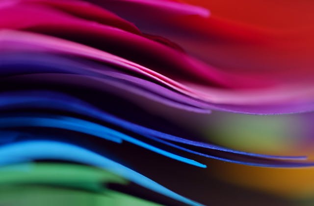
Table of Contents
Paint Color Psychology in Interior Design
Paint Color psychology plays a pivotal role in interior design, as different colors can evoke various emotions and affect the overall ambiance of a space. For instance, warm tones like red and orange tend to create an inviting and cozy atmosphere, perfect for areas where socialization is key, such as living rooms or dining spaces. On the other hand, cool colors like blue and green are known for their soothing and calming effects, making them ideal for bedrooms or home offices where relaxation and focus are essential.
Understanding the psychological impact of colors can help homeowners strategically choose hues that align with the desired mood and function of each room. By incorporating this knowledge into interior design decisions, individuals can create spaces that not only look aesthetically pleasing but also promote well-being and enhance the overall living experience.
Understanding Different Color Families
When it comes to interior design, understanding the different color families is essential in creating a harmonious and visually appealing space. Colors can be categorized into primary, secondary, and tertiary colors. Primary colors, including red, blue, and yellow, are the foundation of all other colors. Secondary colors are created by mixing two primary colors together, such as green, purple, and orange. Tertiary colors are formed by mixing a primary color with a secondary color, resulting in shades like red-orange or blue-green.
Each color family evokes different emotions and moods, impacting the overall feel of a room. Warm colors like red, orange, and yellow are known for their energetic and stimulating effects, making them ideal for spaces where socialization and activity are encouraged. On the other hand, cool colors such as blue, green, and purple have a calming and relaxing influence, making them suitable for areas meant for unwinding and relaxation. Understanding the nuances of each color family can help you make informed decisions when selecting paint colors for your interior spaces.
How Lighting Affects Paint Color
Proper lighting plays a crucial role in how paint colors appear within a space. Different types of lighting can greatly affect the perceived color of walls, making it essential to consider the lighting conditions in a room before choosing a paint color. Natural light tends to bring out the truest colors in paint, while artificial lighting can cast a warm or cool tone that alters the perceived hue of the walls.
It is important to test paint colors under various lighting conditions to ensure that the chosen hue complements the room’s overall aesthetic. Harsh overhead lighting can create shadows and highlight imperfections on the walls, whereas softer, warmer lighting can create a more inviting and cozy atmosphere. Understanding how lighting affects paint color is key to achieving the desired ambiance and visual impact within a space.
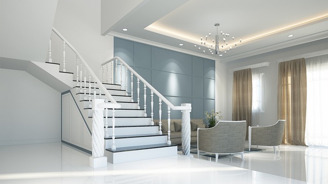
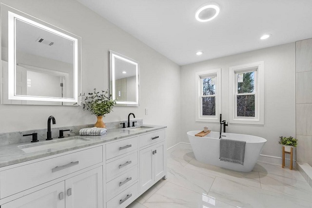
Popular Interior Paint Colors for Different Rooms
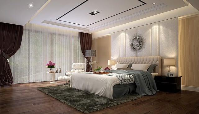
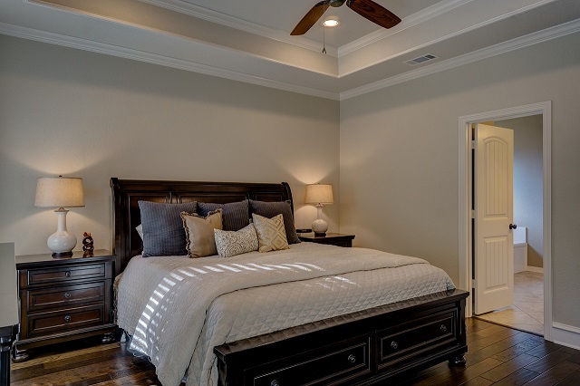
When it comes to selecting interior paint colors for different rooms in your home, it’s essential to consider the function and ambiance you want to create in each space. For a calming and peaceful atmosphere in the bedroom, opt for soft and soothing hues such as pale blues, gentle greens, or subtle lavenders. These colors promote relaxation and tranquility, making them ideal choices for a restful sleep environment.
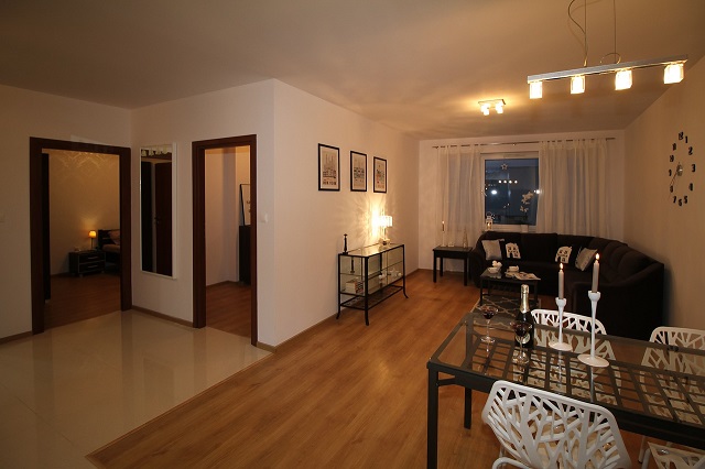
In the kitchen, where creativity and energy flow, consider brighter and more vibrant shades like sunny yellows, cheery oranges, or lively reds. These colors can help stimulate appetite and create a lively atmosphere for cooking and gathering with loved ones. Additionally, in communal spaces like the living room or dining area, neutrals such as warm beiges, soft grays, or creamy whites can serve as a versatile backdrop for various decor styles and allow for easy coordination with furniture and accessories.
Choosing Paint Finishes for Different Surfaces
Selecting the right paint finish is crucial to achieving the desired look and durability for different surfaces in your home. When deciding on the finish, consider the level of traffic and moisture in the area. High-traffic areas like hallways and kitchens benefit from a satin or semi-gloss finish, as they are easier to clean and more resistant to wear and tear. For walls with imperfections or in rooms with less natural light, a flat or matte finish can help hide flaws and create a sophisticated, velvety appearance.
When painting trim, doors, and cabinets, opt for a gloss or high-gloss finish to add contrast and create a polished look. These finishes are also more durable and easier to clean, making them suitable for surfaces that are frequently touched or exposed to moisture. Remember to consider the overall aesthetic you want to achieve in each room and select paint finishes that complement the style and function of the space.
How to Test Paint Colors Before Committing
When considering a new paint color for your interior space, it is essential to test the color before making a final decision and committing to it. One effective way to test paint colors is by using sample pots, which are small containers of paint available for purchase in most paint stores. Before application, it is recommended to paint a small section of the wall in the room you are planning to paint. This will allow you to see how the color looks in different lighting conditions throughout the day.
Additionally, creating a larger paint swatch on a white poster board and moving it around the room can help you visualize how the color will appear on the walls. This technique allows you to observe how the paint interacts with the room’s furnishings and decor. Keep in mind that colors may appear differently depending on the room’s natural light, artificial lighting, and the time of day. By testing paint colors in various spots and lighting conditions, you can make a more informed decision before committing to a specific color scheme.
Tips for Creating a Cohesive Color Scheme
When creating a cohesive color scheme for your interior design, it is essential to start by selecting a dominant color for the space. This dominant color will serve as the foundation and tie the different elements of a room together. Consider choosing a versatile neutral shade such as grey, beige, or white as the dominant color, as these tones can easily complement a variety of other hues.
Once you have established your dominant color, the next step is to select a secondary color to provide contrast and visual interest. This secondary color should complement the dominant color while adding depth to the overall design scheme. You can choose a secondary color that is adjacent to the dominant color on the color wheel for a harmonious look, or opt for a complementary color for a bolder contrast. Remember to also incorporate accent colors sparingly to add pops of color without overwhelming the space.
Using Accent Walls to Add Depth to a Room
Accent walls are a popular way to create visual interest and add depth to a room. When choosing a color for an accent wall, consider selecting a shade that complements the existing color scheme in the space. Opt for a bold and contrasting hue to make the accent wall stand out and draw the eye, creating a focal point in the room.
In addition to using paint, consider other materials for accent walls such as wallpaper, wood paneling, or textured finishes. These options can add dimension and texture to the room, enhancing the overall ambiance. Remember to balance the accent wall with the rest of the room’s decor to ensure a harmonious and cohesive look.
Painting Techniques for Small Spaces
Painting small spaces requires careful consideration and strategic techniques to make the most of the limited area. When tackling a small room, opting for light and neutral paint colors can help create a sense of openness and airiness. Soft tones such as whites, beiges, and pastels can visually expand the space, making it feel larger and more welcoming. Additionally, using a single color throughout the room can help maintain continuity and prevent the space from feeling disjointed.
Incorporating reflective finishes such as satin or semi-gloss paints can also enhance the perception of space in small rooms by bouncing light around the area. These finishes can help illuminate the room and create a sense of depth, making it appear more expansive than it actually is. Implementing these painting techniques in small spaces can transform cramped quarters into inviting retreats that feel cozy yet spacious.
Incorporating Trendy Colors in a Timeless Design
When incorporating trendy colors into a timeless design, it’s essential to approach it with careful consideration and balance. Trendy colors can inject freshness and modernity into a space, but it’s crucial to ensure they complement the overall aesthetic and won’t quickly go out of style. One effective way to achieve this is by incorporating trendy hues through easily replaceable items like throw pillows, artwork, or accessories. This way, you can experiment with new colors without committing to a long-term design element.
To seamlessly blend trendy colors into a timeless design, consider using them in moderation and pairing them with classic neutrals or muted tones. For instance, a pop of a trendy color in a room with a predominantly neutral palette can create a focal point and add interest without overwhelming the space. Additionally, choosing one or two trendy colors to emphasize throughout a room can create cohesion and a sense of purposeful design. By carefully integrating trendy colors into a timeless backdrop, you can achieve a harmonious balance that celebrates both modern trends and enduring style.
The Importance of Considering Furniture and Decor When Choosing Paint Colors
When choosing paint colors for your interior spaces, it is crucial to consider the existing furniture and decor in the room. The colors of your walls should complement and enhance the pieces you already have, creating a harmonious and visually appealing environment. Take into account the style, material, and colors of your furniture, as well as any decorative elements like artwork or textiles. By coordinating your paint colors with the rest of your furnishings, you can create a cohesive look that ties the room together seamlessly.
Mismatched paint colors can clash with your furniture and decor, creating a disjointed and chaotic feel in the room. To avoid this, take cues from the colors present in your furniture and decor pieces when selecting your paint palette. Consider creating a color scheme that incorporates shades already present in your furnishings or choose complementary colors that will work well with the overall aesthetic of the room. By aligning your paint choices with your existing furniture and decor, you can create a cohesive and inviting space that reflects your personal style and vision.
How to Create a Mood with Paint Colors
When it comes to interior design, the use of paint colors plays a crucial role in setting the mood of a space. Each color has the potential to evoke different emotions and energies, ultimately influencing how a room feels. By strategically selecting the right hues, you can create a desired atmosphere that aligns with the purpose of the room or your personal preferences.
Warm colors like red, orange, and yellow are known to bring a sense of coziness and vibrancy to a space. They can make a room feel more inviting and energetic, making them great choices for areas where socializing or entertaining take place. On the other hand, cool colors such as blue, green, and purple have a calming and soothing effect. These shades work well in places meant for relaxation, like bedrooms or reading nooks, helping to create a serene and tranquil ambiance.
Avoiding Common Mistakes When Selecting Interior Paint Colors
When selecting interior paint colors for your home, it is important to avoid common mistakes that can lead to dissatisfaction with the end result. One common mistake is failing to consider the existing elements in the room, such as furniture and decor. It is essential to choose paint colors that complement these elements rather than clash with them. Additionally, overlooking the natural lighting in the room can result in a color that appears drastically different once it is applied to the walls. Always test paint colors in the actual space to see how they look in different lighting conditions throughout the day.
Another mistake to avoid is choosing a paint color based solely on current trends. While trendy colors may seem appealing at the moment, they can quickly become outdated, leaving you with a room that feels out of style. Instead, focus on selecting timeless colors that create a cohesive and harmonious look for your space. Keep in mind the mood you want to evoke in each room and choose paint colors that align with that vision. By taking the time to carefully consider all factors involved in selecting interior paint colors, you can create a space that is not only visually appealing but also reflects your personal style and preferences.
Working with a Professional Painter for Expert Advice
For those seeking expert guidance and precision in their interior paint projects, collaborating with a professional painter can be a prudent decision. Professional painters bring a wealth of knowledge and experience to the table, ensuring that your vision is executed with finesse and accuracy. Their proficiency in color theory, surface preparation, and application techniques can elevate the overall aesthetic appeal of your space.
In addition to their technical expertise, professional painters can also offer valuable insights and recommendations based on current trends and best practices in the industry. By consulting with a seasoned professional, you can benefit from their expert advice on color selection, finish options, and maintenance tips, tailored to suit your specific preferences and requirements. This collaborative approach can streamline the painting process, minimize potential errors, and ultimately result in a polished and cohesive end result.
Maintenance Tips for Keeping Your Interior Paint Fresh and Vibrant
To ensure your interior paint stays fresh and vibrant for years to come, regular maintenance is key. Start by routinely dusting and cleaning your painted surfaces to prevent buildup that can dull the color over time. Use a soft cloth or a gentle brush to remove dust and dirt without scratching or damaging the paint. For tougher stains, opt for a mild detergent and water solution, being careful not to scrub too vigorously to avoid wearing down the paint.
In addition to cleaning, it’s important to keep an eye out for any signs of damage or wear on your painted surfaces. Touching up small scratches or chips promptly can prevent them from becoming larger problems that require more extensive repair. Keep some extra paint on hand for touch-ups, making sure to store it properly to maintain its freshness and color match. By staying proactive with maintenance and touch-ups, you can preserve the beauty and longevity of your interior paint job.